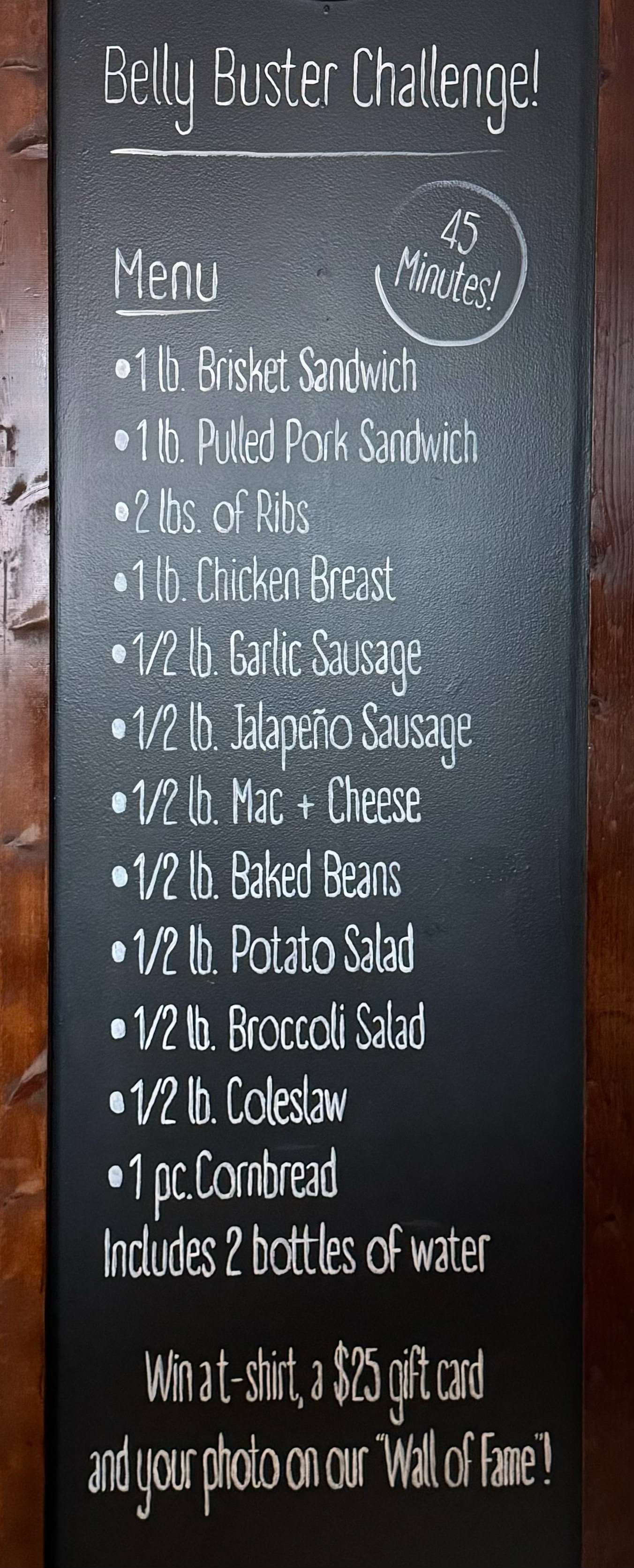
I will work with you directly to completely redesign your space! From restaurants, to workshops, to office spaces, i'll help you utilize your space to the fullest!
At the end of 2023, I got the opportunity to help redesign and physically remodel the inside of a local restaurant. Starting with some smaller details like take-out menus and sauce bottle labels turned into something much bigger!
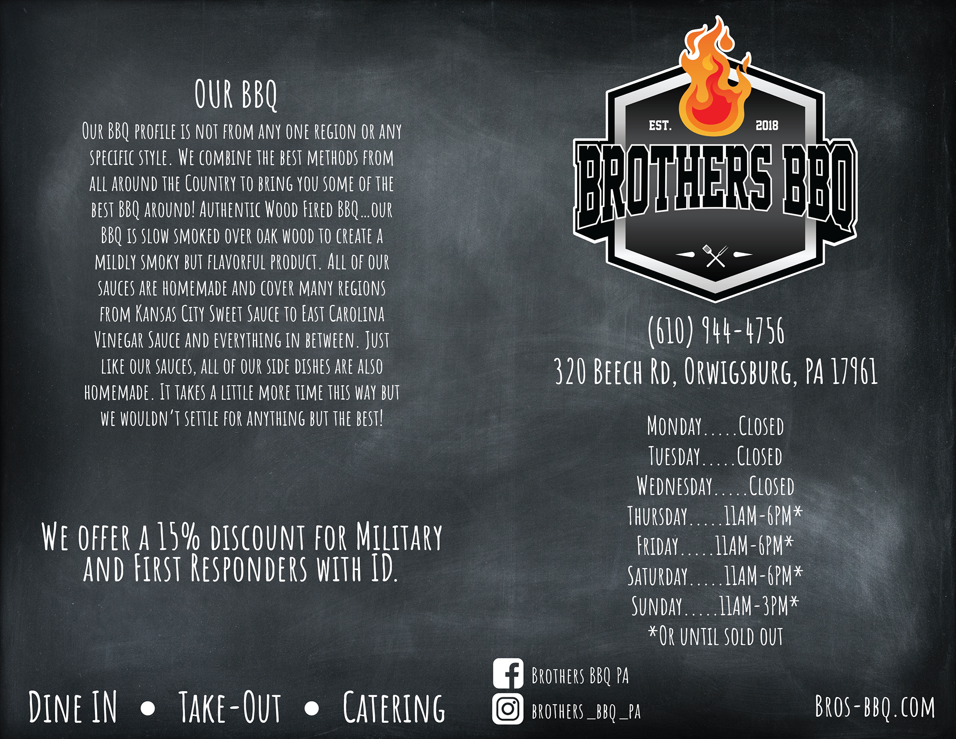
The owners wanted a "chalkboard" feel when it came to their menu.
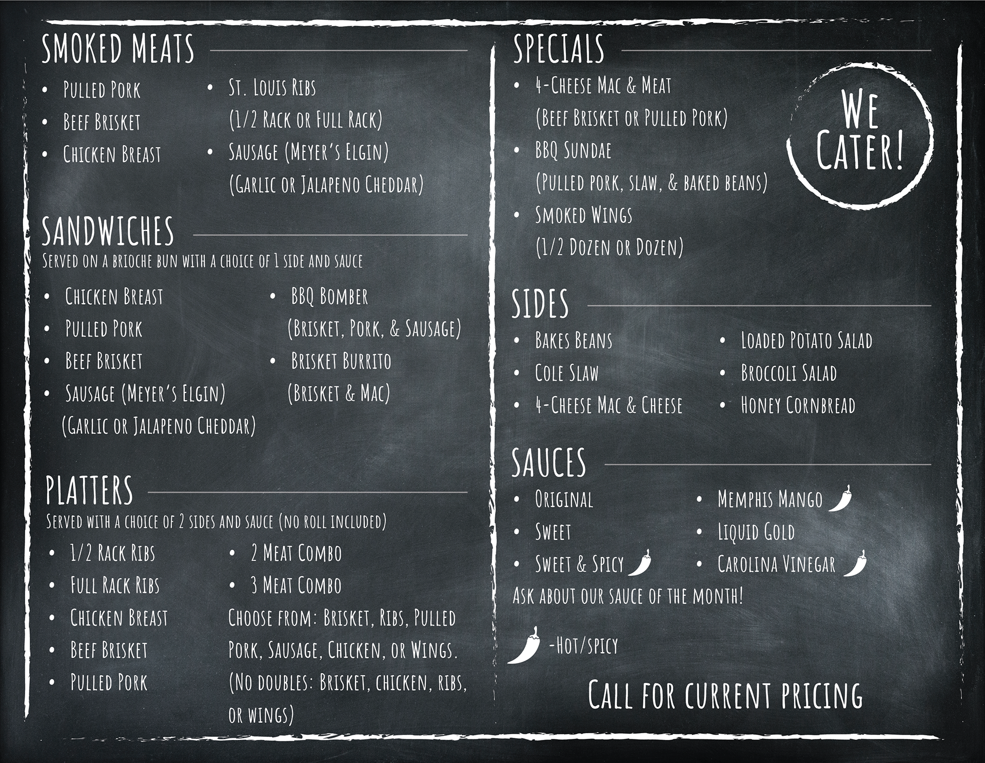
The prices in this restaurant constantly change due to meat prices fluctuating, so we solved this with a simple "call for current pricing".
Before the remodel:
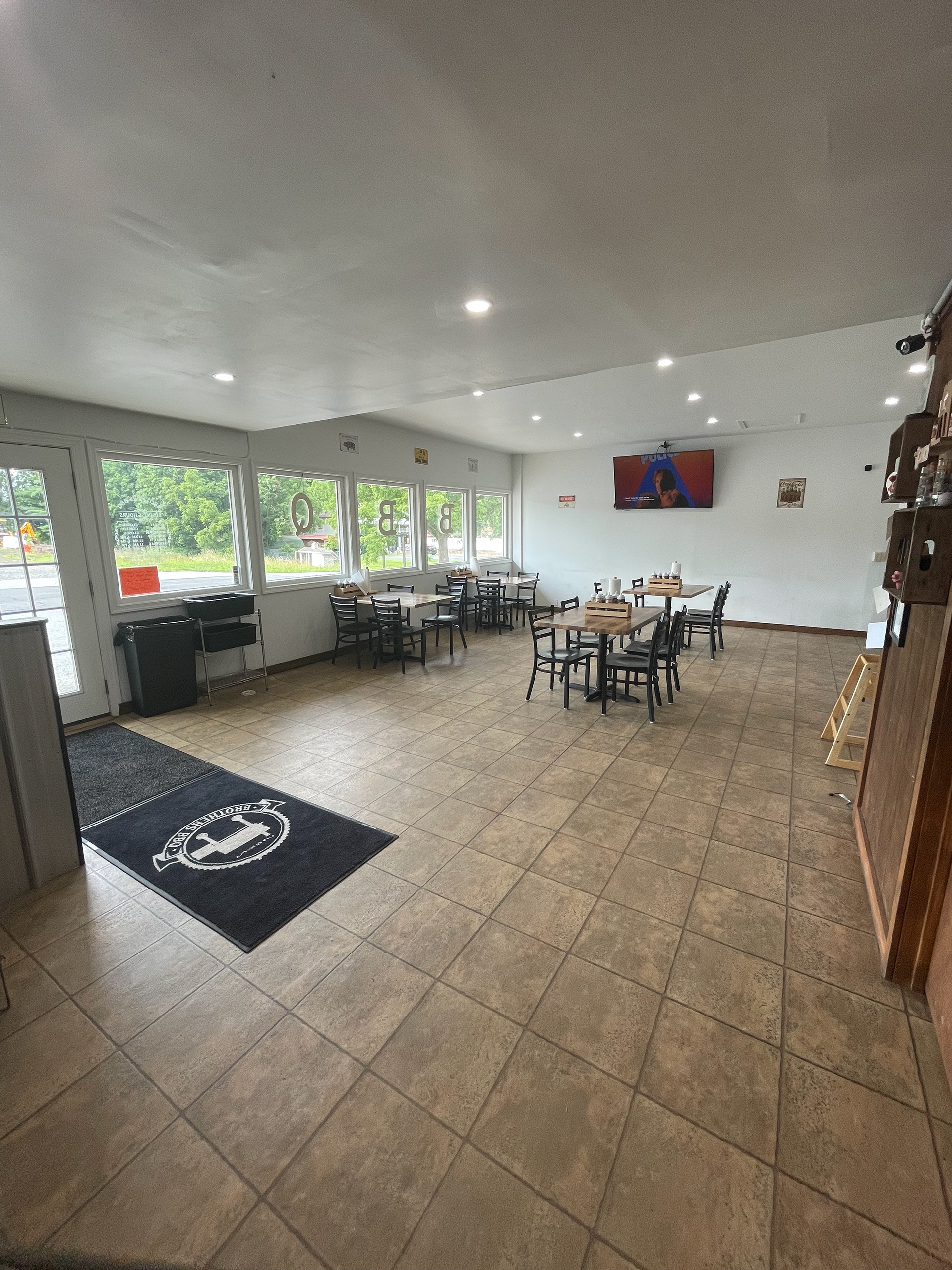
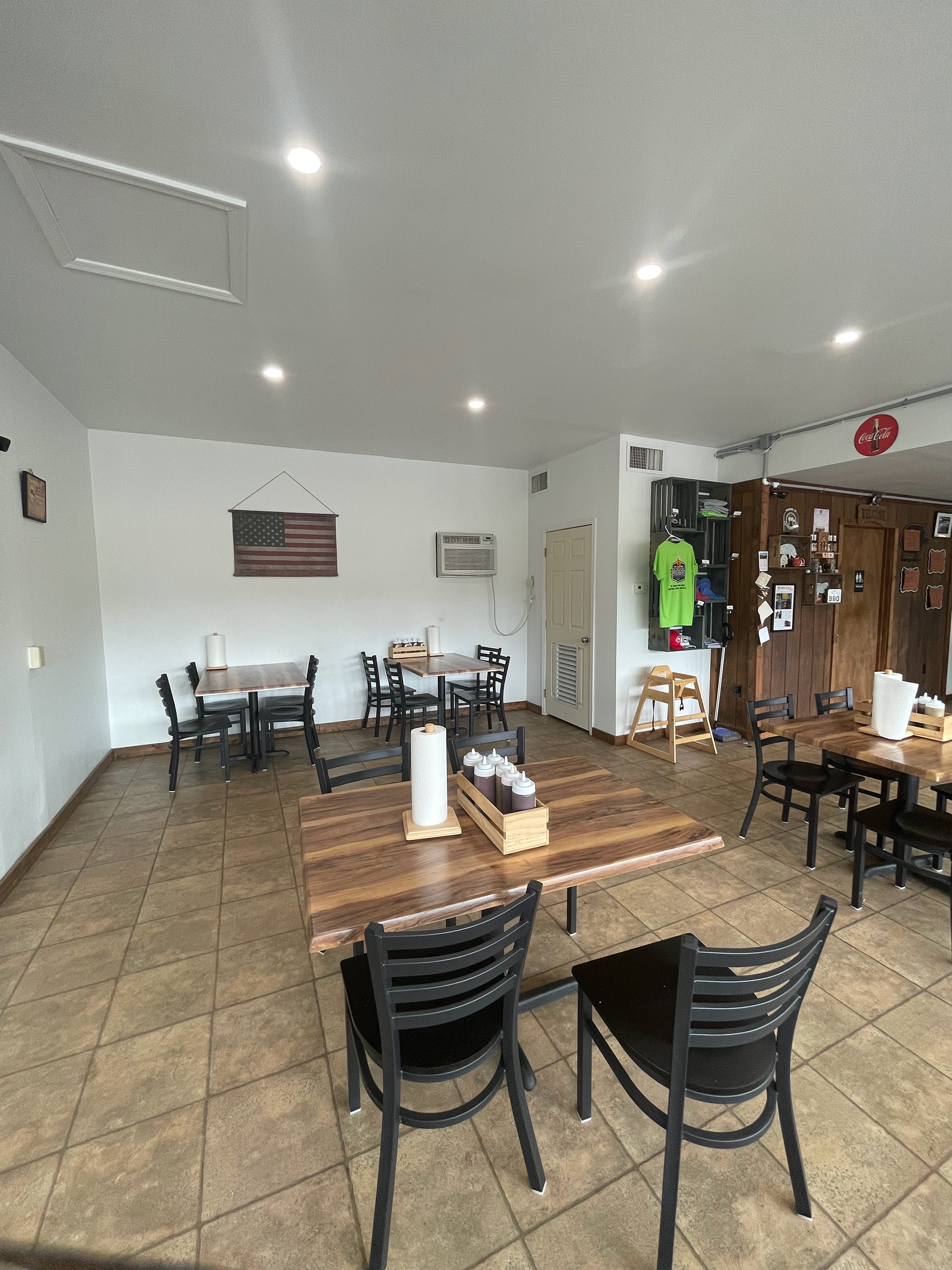
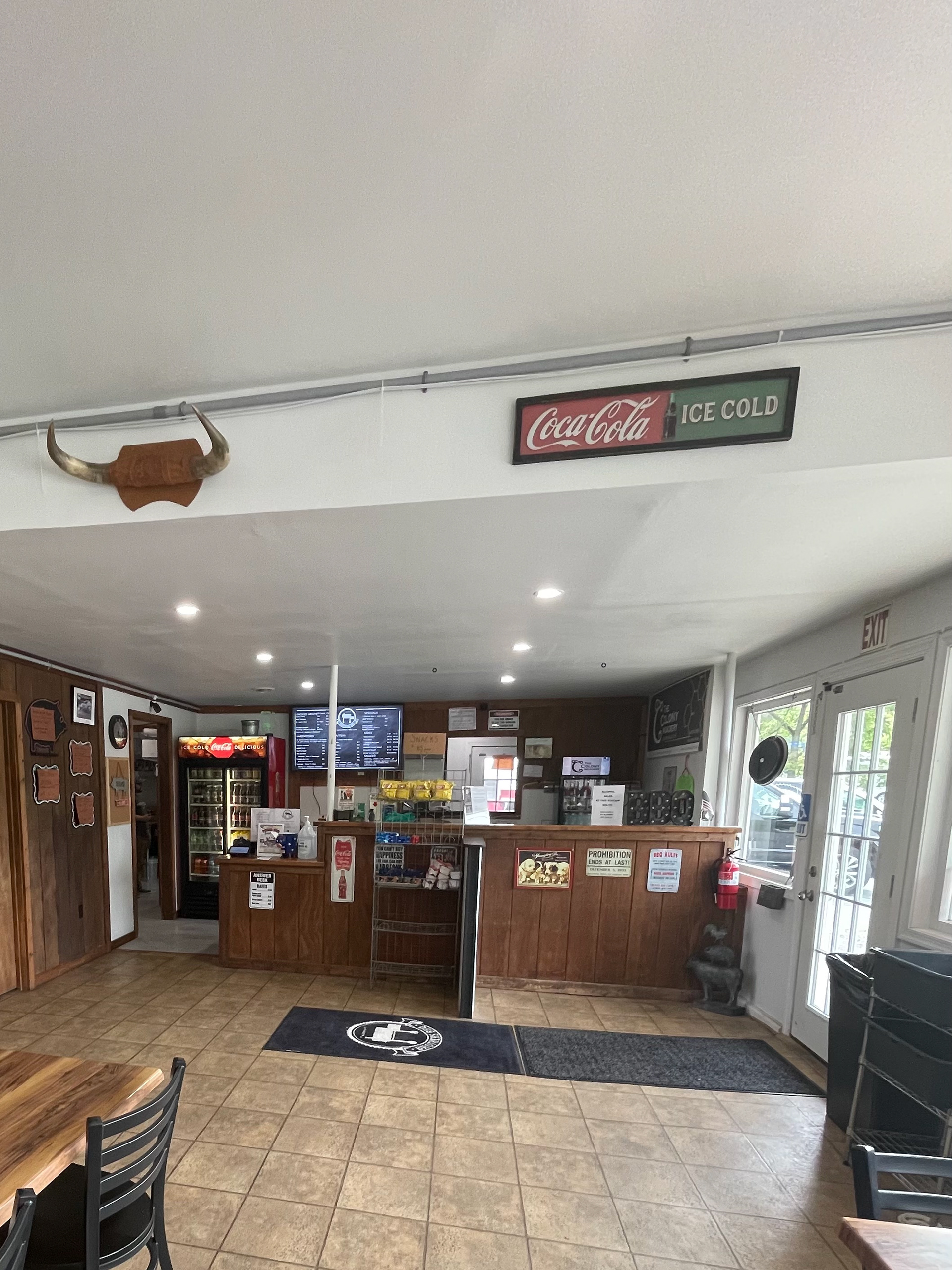
After the remodel:
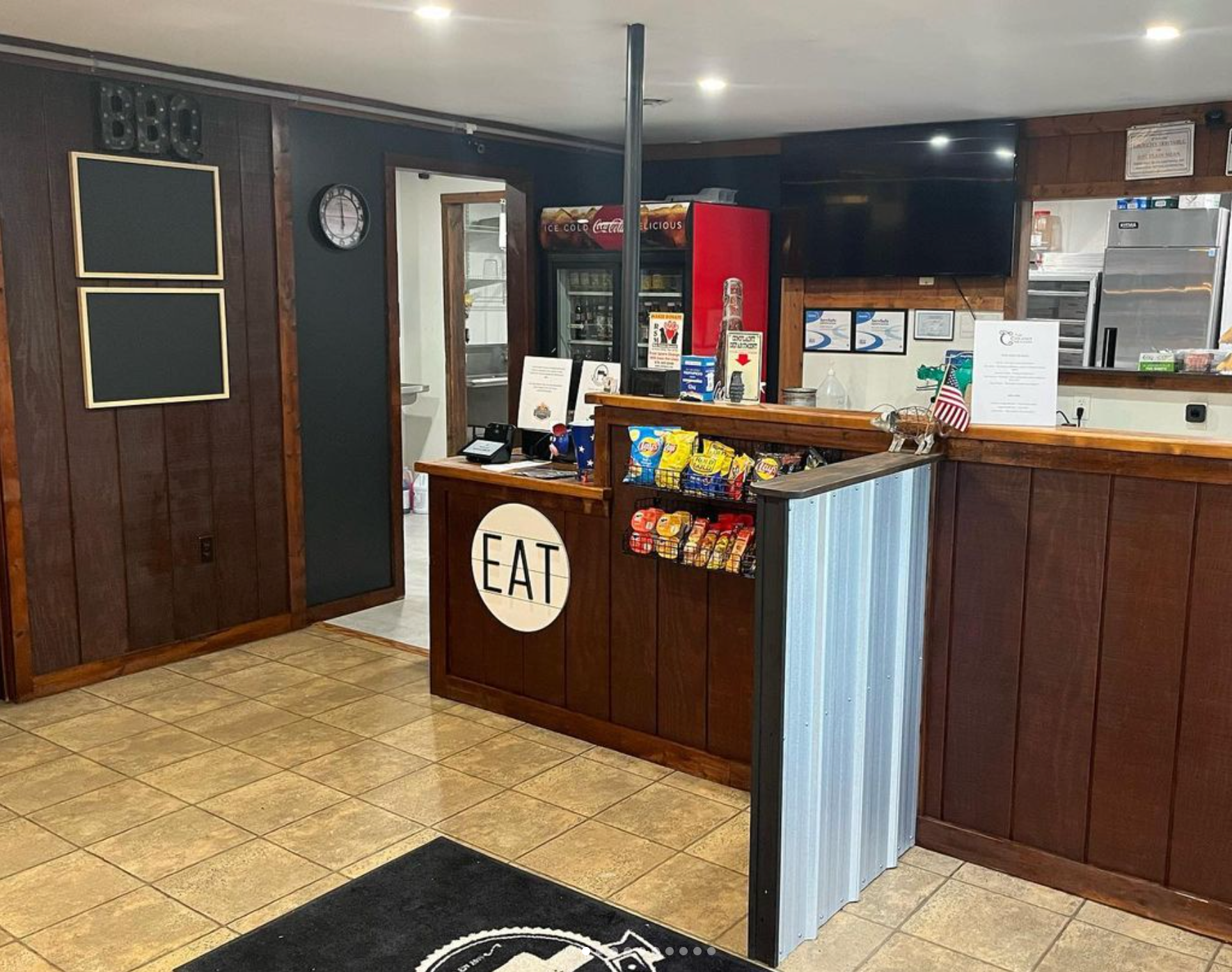
Writing the weekly specials on butcher paper wasn't the best look, so we upgraded to chalkboards! As well as sizing down the snack rack so it no longer blocked the view to the dining room.
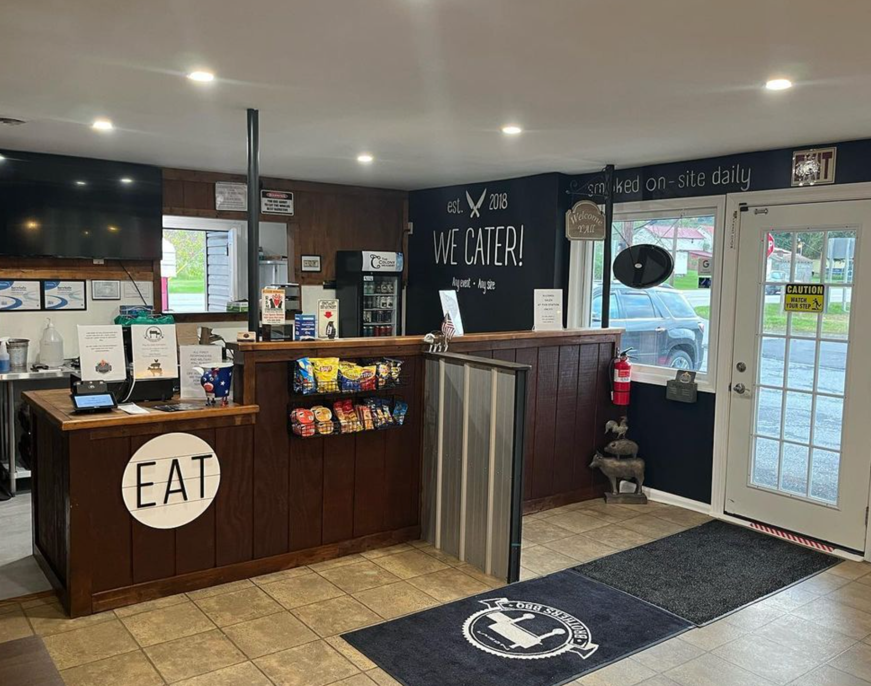
The counter area felt too cluttered, so we minimized the amount of hanging items and went for a more minimalistic look.
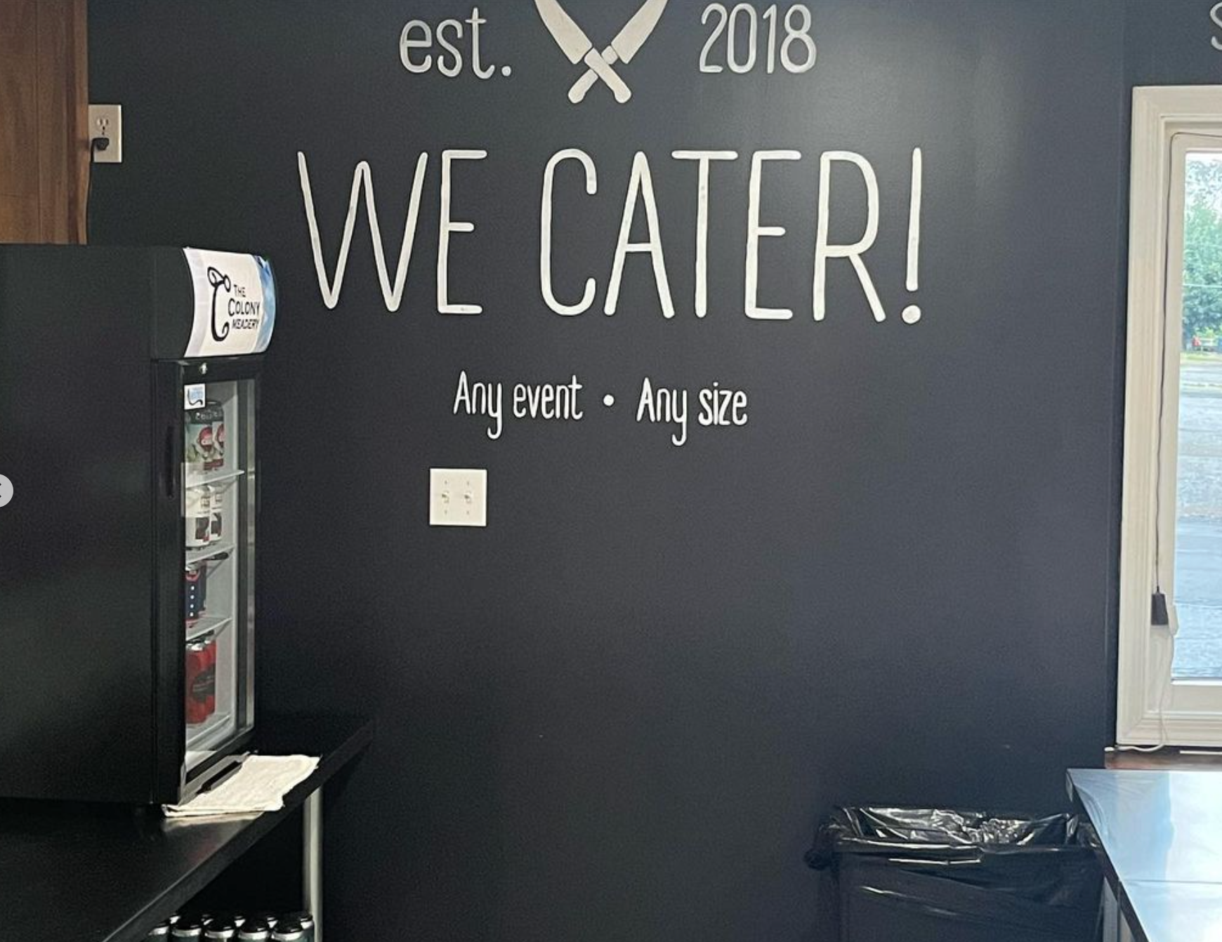
The owners wanted a simple way to remind people that the restaurant caters for any events.
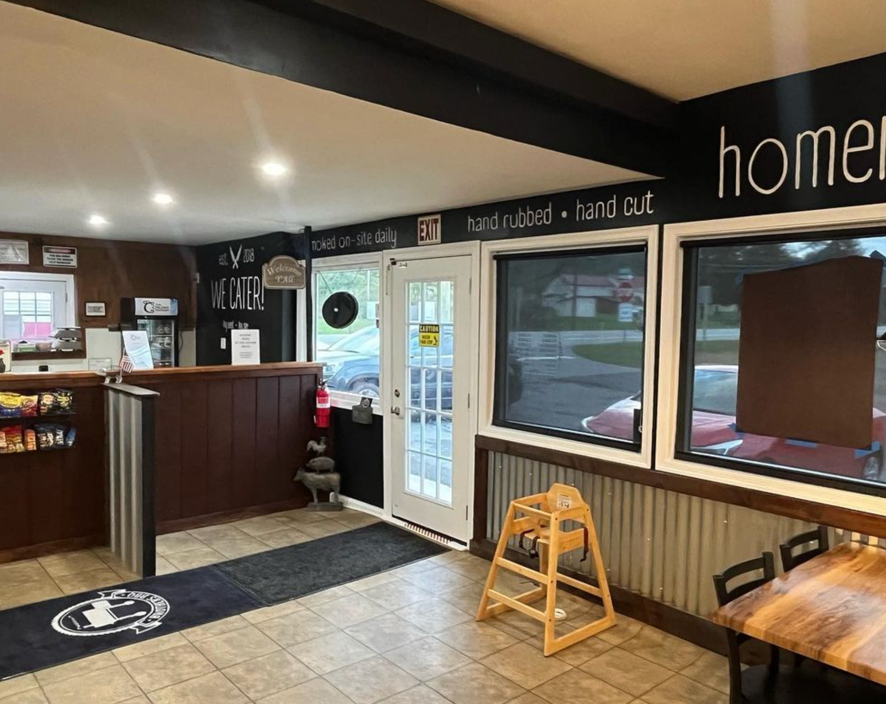
We wanted to remind people that our food is prepared with care!
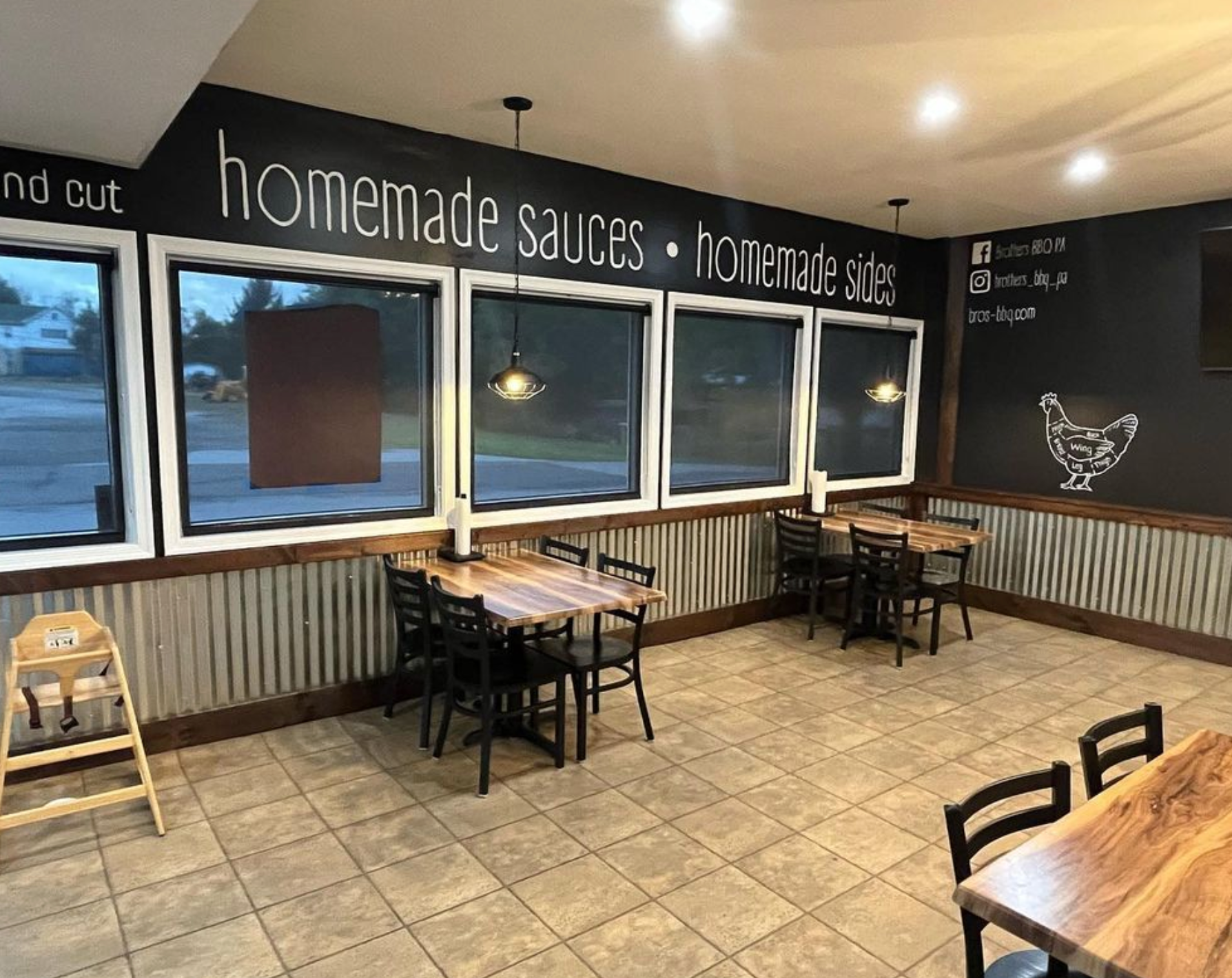
There was too much natural sunlight coming in, so we decided to get custom shades and new table lighting to give the dining room a nice atmosphere.
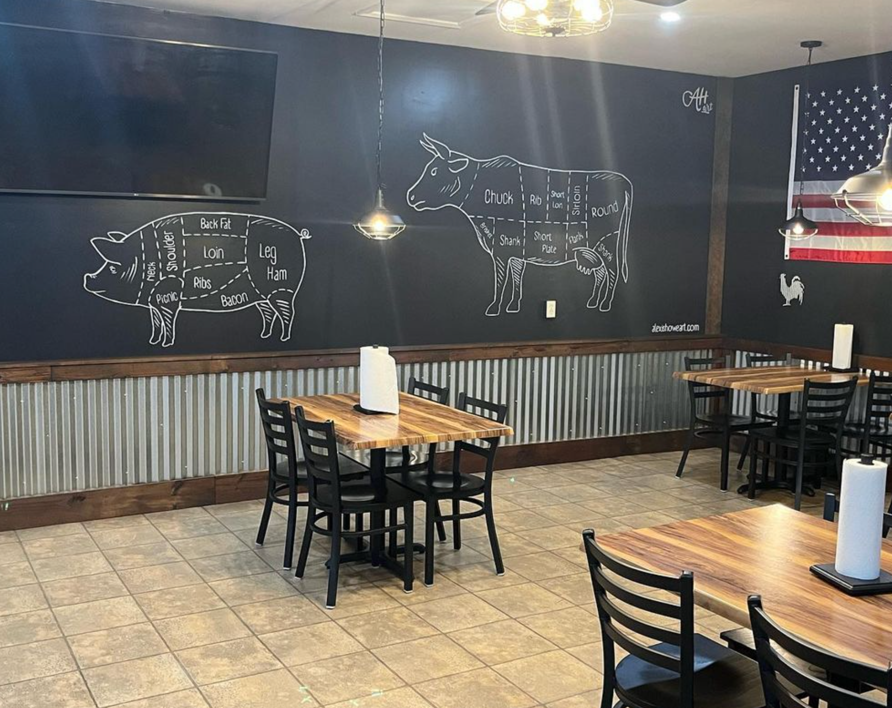
We wanted the walls to have some sort of decorations but didn't want to clutter it with hanging items, so we went with hand painted art instead!
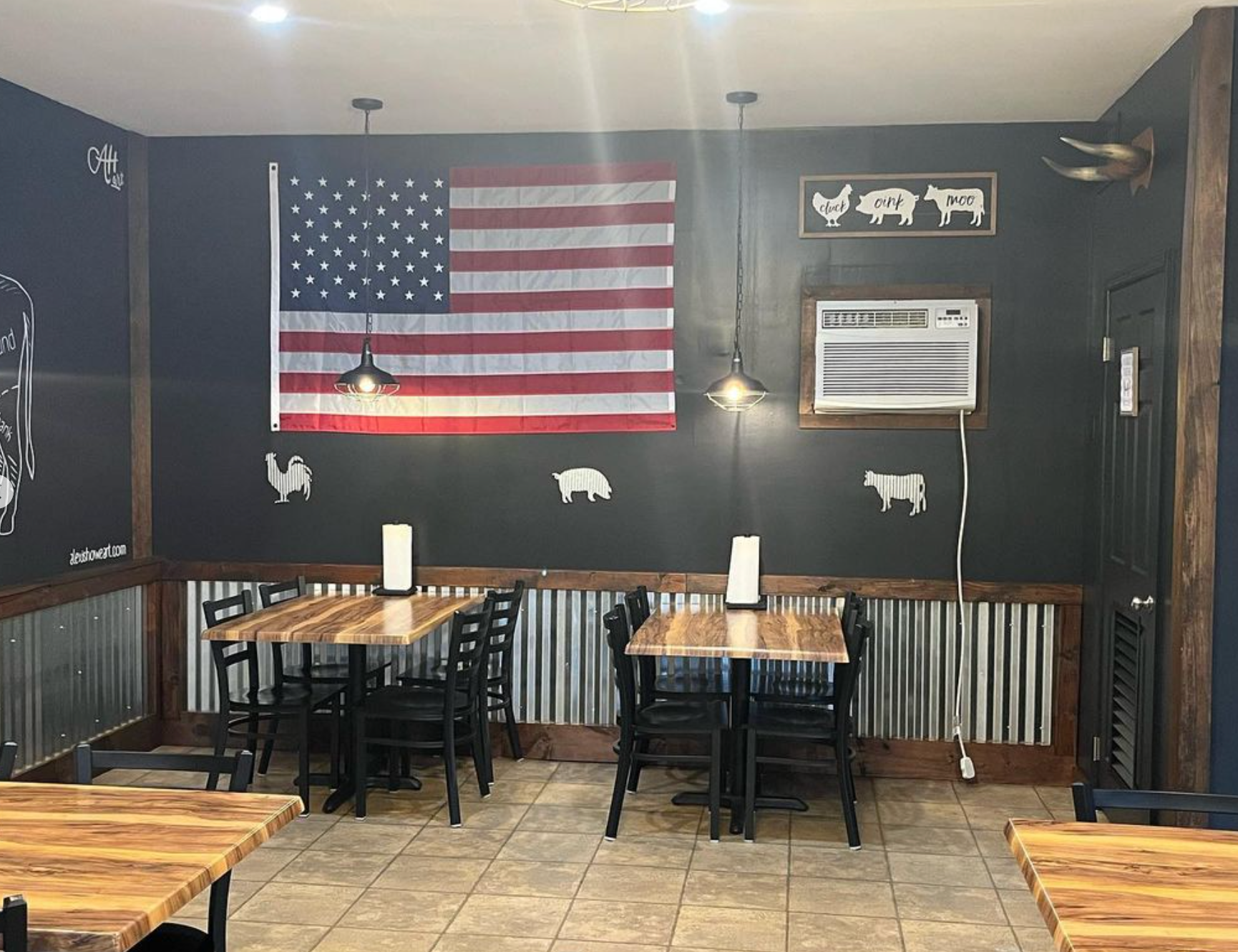
We added a dash of color with the American flag.
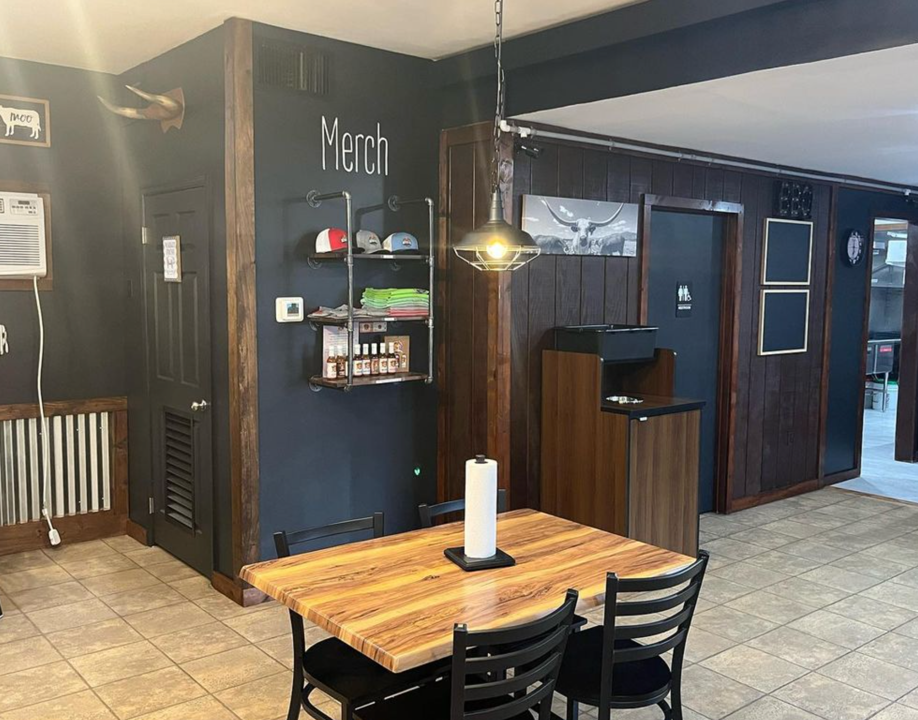
We wanted a more minimalistic look when it came to the merch wall, so we narrowed down the shelving and added a nice little call to attention with the "merch" above the shelves.
